CTolleRun.com Redesign
🔗 a linked post to
ctollerun.com »
—
originally shared here on
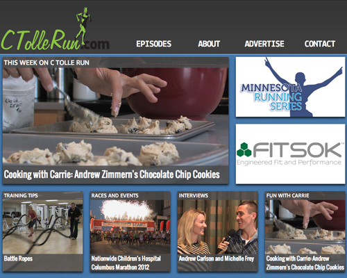
This week, we launched version 3 of CTolleRun.com. It's the result of several months of planning, organizing and development, and I thought I would take a few moments to share exactly what we've changed and the process behind it.
Our last redesign of the webpage was earlier this year. Truthfully, the site was rushed out in a hurry because we needed to have something live, so I pushed it out with the intention of upgrading it piece-by-piece down the line. Of course, we never got around to actually upgrading anything, and ultimately, we decided that time would be better spent on re-building from the ground-up.
The biggest conceptual change on the site was to give each episode its own page. This would give us a chance to better showcase our content, as well as drive our SEO. In order to implement this, however, required implementing a more robust, custom CMS1. Before this redesign, we were able to input the basic information: episode name, description, YouTube link, etc. Now, we are able to add several elements which make each page unique and more appealing for our viewers:
Links Almost every podcast I admire includes a list of links with each episode. This makes it easy to give viewers the chance to dive deeper into a specific topic, as well as share links we've mentioned in the episode. It also allows us to drive more traffic to the photo albums we've uploaded to Facebook.
Featured Guests We have the luxury of having some pretty awesome people on our show. Unfortunately, many of the guests we've had on our show aren't yet household names. Many people know who Kara Goucher is, but not a lot of people recognize Hassan Mead. If a viewer doesn't recognize who they're about to watch, it doesn't give them a lot of incentive to watch the episode.
To combat this, we included a short biography of each guest. We figured it's a simple way to boost viewership of those episodes as well as rank them higher on Google. In the future, I'm hoping to add links to these guest's social media accounts, as well as personal blogs or team pages.
Sponsors Before I became an avid podcast consumer (and creator), I loathed advertising. I ran ad-blockers on all my computers and I skipped over every sponsorship spot I possibly could.
It's really a shame, though, because a lot of the advertisers who throw money at podcasts like ours really seem to get it. They just want to put their product or race in the hands of people who maybe would've never even heard of it otherwise.
It's understandable that you don't want ads shoved down your face, though, which is why we've presented our ads in the ways we have. Each episode with a sponsor gets mentioned at the top of the show, and each sponsor gets an ad permanently embedded on the episode's page. We also have two "title sponsor" spots that are prominently displayed on the main page. That's it.
We think this is win-win-win: we are able to get you in touch with our sponsors, our sponsors are able to get permanent placements of their product and you are able to find out about some cool products, services and races without being hassled.
Social Media A huge focus for this redesign was to better integrate the site with social media. Here's what we did to optimize for our key three networks:
Facebook: If you're a developer, and you're not using Open Graph tags, you're missing out. By using Open Graph tags, we were able to turn our bland-looking links into this:
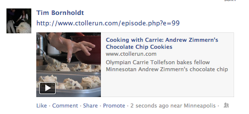
An added bonus: if you specify the OG tags for og:video and og:video-type, Facebook will embed the YouTube video in-line! Here's the code I used for that:
    <meta property="og:video" content="http://www.youtube.com/v/<? echo $youtubeID; ?>?version=3&autohide=1" />
    <meta property="og:video:type" content="application/x-shockwave-flash" />
Twitter:
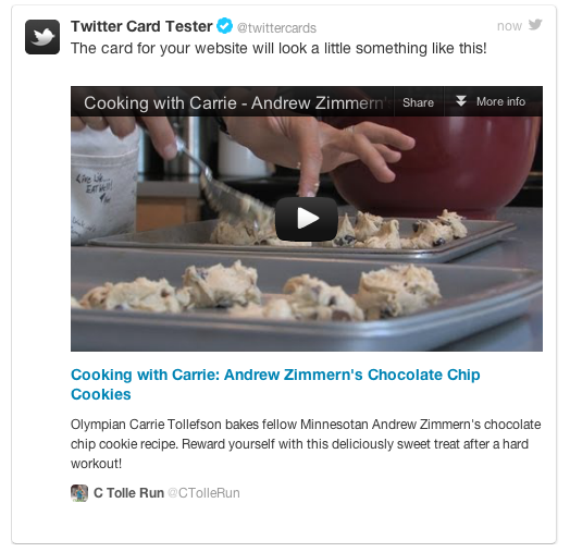
If you're not simply sharing an article or some photos, Twitter's new Cards functionality is a bit more complex than simply adding OG tags. In order to make a functioning Player Card, Twitter wants you to build a page that gets embedded in an IFRAME. In a similar vein to what we're doing with Facebook, we're standing on the shoulders of giants and simply embedding YouTube's Player Card with our episode ID passed through:
    <meta name="twitter:card" content="player" />
    <meta name="twitter:site" content="@CTolleRun" />
    <meta name="twitter:player" content="https://www.youtube.com/embed/ echo $youtubeID; ?>" />
    <meta name="twitter:player:width" content="640" />
    <meta name="twitter:player:height" content="360" />
And out comes this:
Note that the Twitter Card API requires the use of twitter:title, twitter:description, twitter:image and so forth. Thankfully, if you're already using og:title, og:description, og:image and so forth, you don't need to re-include them.
Pinterest: Unfortunately, Pinterest doesn't have a public-facing API yet. Essentially, all we can do is include a "Pin It" button for each episode. We'd really like to get a bigger presence on Pinterest, however, because it seems like a good portion of our target audience is there. Here's hoping for that API soon!
A note about Google+, App.net, etc.: I think it's important to not get too crazy with social networks. Sure, it's easy enough to drop a +1 button on each page, as well as a hundred other buttons. However, for each service you include, you're not only adding more visual clutter to your page; you're increasing the page's load time by executing a hundred different pieces of remote Javascript code.
If we get a huge demand to add another service to our site, or if Facebook loses a million followers, we'll go there. We're not dummies, but we're also not in the business of predicting which services will be the best. Facebook, Twitter and Pinterest seem to be our best options today. We'll adapt as time goes on.
More Robust RSS Feeds Our RSS feeds (video and audio) aren't the most popular way to get our episodes2, but it's my personal favorite, so I made an effort to optimize this experience as well. Each item in the feed includes the linked list as well as the episode's sponsors. We also include the file size and run time of each episode, which means the fancy podcast clients will be able to show that information without any big-city processing on their end.
MailChimp We converted our mailing list over to the incomparable MailChimp. It's everything you could possibly want in a mailing list provider, but for free. My only gripe with them thus far is that the templates aren't 100% customizable, but it's just about the only fault I can find with them. Seriously, if you do mailing lists, you should be doing them through MailChimp.
Front Page Slide Show
Whenever a client requests a rotating slide show, my go-to choice has always been Nivo Slider. For this project, however, I needed a solution that allowed me to use two <div> tags for a caption (one on top, one on bottom). With Nivo Slider, the solution I came up with was to put two smaller <div>'s into 1 giant <div>. Unfortunately, that meant the image wasn't clickable, which defeated the purpose of the slider.
I tried a few different sliders and ultimately settled on Camera by Pixedelic. This awesome slider allowed me to place as many <div>'s (or any other kind of crazy mark-up) on top of the image while maintaining its clickablilty. My only gripe is that the slideshow doesn't work as well in IE, which is, of course, no surprise to anyone.
Internet Explorer Fixes
Speaking of every web developer's best friend, Internet Explorer provided the majority of trouble for this redesign. I kept getting alignment issues with IE while using Nathan Smith's excellent 960 Grid System, so instead of learning a whole new system (like the Responsive Grid System which I'm highly considering for future projects), I just added the <meta> tag which forces IE to render everything as if its IE7 (even if you're on a newer version):
<meta http-equiv="X-UA-Compatible" content="IE=EmulateIE7" />
Of course, this is a very inelegant solution, but I'm just sick of wasting so much time making sites look good in IE when every other browser (even Opera) gives me less guff.
Embedded Tweets in the Footer It's all about keeping your site fresh and up to date, right? I thought the best way to do this was to write a script that cached our latest Tweet server-side. I'm not sure if it fully complies with the infamous Rules of the Road, but since our use doesn't really allow for tons of Branding®©™, I think we'll be okay.
I ended up using WebcodingEasy.com's fantastic Convert twitter created_at time format to ago format script to make our time appear like Twitter's "12 minutes ago" format, as well as another open source script (which I, embarrassingly, can't find right now) to convert all tweeted links into clickable links.
The toughest part was writing the Tweet caching script. Essentially, my script reads a Tweet which was saved onto the sever from the Twitter API. When it's saved, I append a variable called cached_Tweet_Time along with the current server time. When someone loads the footer, it will read the cached Tweet and check the time. If it's less than a minute old, the script returns the Tweet from the server. If it's more than a minute old, it fetches a Tweet from Twitter. If anyone is interested in the source code, let me know and I'll post it here.
In the future, I'd like to append the script so it only returns Tweets which aren't "at-replies".
In Conclusion This has been one of the most ambitious site designs I've ever completed3, and I am quite pleased with how it has turned out. Front-end design has never been my strong suit; in fact, most of my designs end up looking the same. This time, however, I forced myself to look outside of my wheelhouse and try something new. I hope you guys like it, and if you have any questions, let me know.
-
Before this redesign, we were running everything on a custom CMS that was integrated with our owner's race results page. The new CMS consists of multiple, custom databases which all link together. :adjusts nerd glasses: ↩
-
I believe (as of a few weeks ago) we have a combined total of 120 subscribers to these feeds, which is in the ballpark to how many people reach our page through our e-mail newsletters. ↩
-
The only bigger project I can think of right now was That's Unpossible, and that underwent somewhere around 9 redesigns and spanned across 6 databases. ↩