I anticipated navigating other challenges, like how to deal with the cognitive dissonance of working for big tech. Could someone who worked for big tech use a flip phone? Yet I liked the idea, argued by Hari, Williams, and Newport, that we need to be aware of technology’s designs and ensure that tech is working for us rather than against us. I didn’t want to throw the baby out with the bathwater when it comes to technical innovations, but I grew increasingly skeptical that my smartphone was working for me.
This whole article combines many disparate sources (like Cal Newport's Digital Minimalism and Rolf Dobelli's Stop Reading the News) into a cohesive manifesto for why we should stand up and reclaim our collective attention spans.
It actually motivated me to take some action.
Last night, I went through every app on my phone and deleted the ones I no longer use. I wasn't too picky though; if I had even a slight inkling that I might need it in the future, I kept it.
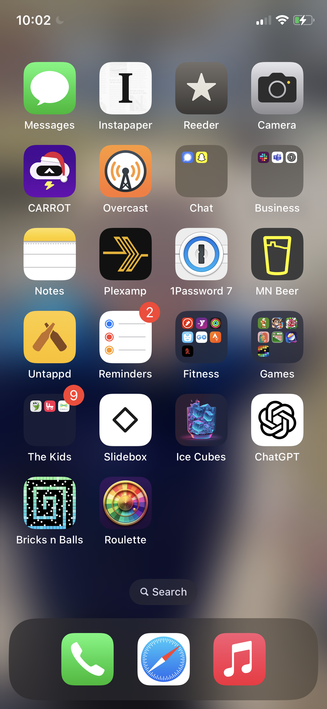
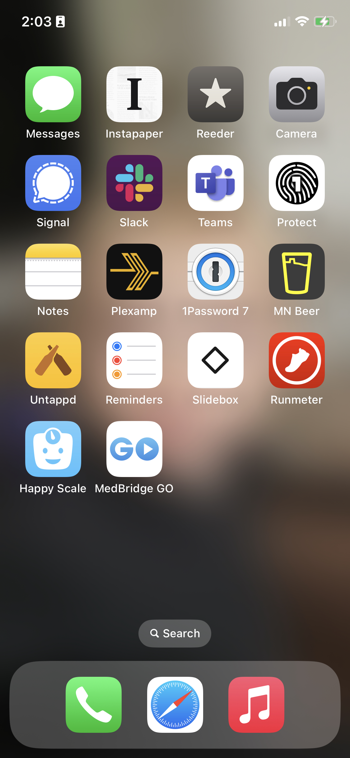
I went from 314 apps to 133.
133 still seems like too much to me, but just imagine the cognitive and infrastructural burden that 181 apps was inflicting on me and my phone!
All that wasted bandwidth to download updates.
All those wasted notifications attempting to get me to come back in.
My home screen went from this:

to this:

It's step one of being intentional with my technology, which is subsequently the first step towards getting my attention back.
Comparing these two screen shots is making me excited to make more cuts. Some of these apps will go away after we wrap up with a client project in the next couple weeks (like Teams and Protect) or when I finish up physical therapy (like Medbridge Go).
Others (like Untappd or MN Beer) are ones that don't really need a front page billing all the time in my life.
More cuts to come in the weeks ahead, to be sure!
Continue to the full article
→
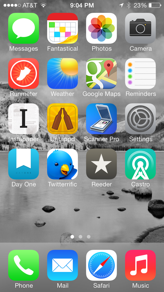
Here's what my home screen looks like as of December 2013: 
Besides the standard apps (Messages, Photos, Camera, etc.), here's a breakdown of the other apps I use:
- Fantastical: Natural language input makes this app throughly indispensable. Being able to just tap the mic icon and speak my appointment makes me really feel like I'm living in the future.
- Runmeter: Any run I do outdoors, I log with Runmeter. I've been using it for years, and it's the most accurate and robust running app I've ever used. I just recently got a heart rate monitor that pairs with it, so I'm excited to see how that integration will aid my training.
- Check the Weater: The simplicity of this app combined with its Dark Sky integration make it the only weather app I need to try. Plus, David Smith is an awesome developer (and human being).
- Google Maps: I'll occasionally use Apple Maps, and while it's definitely improving, it's still bit me too many times to trust on a day-to-day basis.
- Instapaper: All long-form articles go in here for future reading. If you're not using a read it later type service, you're missing out on a much more satisfying reading experience.
- Untappd: I've become much more of a beer enthusiast in the past year, and that's almost entirely due to this app. Untappd lets you log beers you've tried and suggests new ones to try. It has certainly turned beer discovery into a fun game.
- Scanner Pro: Apple recently made this app free for a week, and for great reason. I switched over to this app to log my business receipts about a year ago, and it's ability to auto-detect borders and quickly upload to Dropbox have made this app worth every penny I've paid for it.
- Day One: I made it a goal part-way through 2013 to start journaling once a week, and Day One is, bar none, the best journaling app on the App Store. Every Friday, I crank this bad boy open and review my week's progress. Every entry gets a picture as well, so that has encouraged me to keep photographing the exciting (or mundane) parts of my life.
- Twitterrific: I haven't tried Tweetbot, and thanks to this app, I really see no reason to. This app helps me manage my Twitter accounts very easily, and it looks gorgeous to boot. I also really enjoy the cool egg "pull-to-refresh" animation.
- Reeder: There's no better way to manage your RSS feeds than Reeder (combined with Feed Wrangler). The only thing I wish it did was allow you to send links to Reminders as a new reminder. But besides that, this is a fantastic example of an iOS 7 app, complete with gestures and the like.
- Castro: Speaking of amazing apps designed with iOS 7 in mind, Castro is a new podcast app that is crazy beautiful. The app is lacking in a couple of key features, like OPML import support and continuous play (and I also miss the gesture-based 30 second skip that Downcast uses), but it's pretty certain that those features will be added in time.
