all posts tagged 'programming'

A Coder's Sprint: Behind The Scenes of the Twin Cities Marathon Graphics

originally shared here on

a road along a river with full fall foliage where many people are running a race

(Editor's note: That graphic is Midjourney's interpretation of what the Twin Cities Marathon looks like. Can you imagine if the Twin Cities Marathon actually looked like that? Running on top of the Mississippi River lmao)

Growing up, I took every chance I could get to be around live TV production.

The thing that keeps drawing me back to the medium is that you basically get one chance to tell a story to which there is an uncertain conclusion. The pressure to get it right is exhilarating.

Even though I haven't been part of a live production in roughly a decade, I had a unique opportunity this past weekend to be part of the live coverage of the Medtronic Twin Cities Marathon.

My role was to be the liaison between the marathon and the production crew who was filming, directing, and producing the show that was to ultimately be broadcast on KARE 11 (the local NBC station). I was to watch the race unfold and keep the crew informed of any interesting moves that we should mention on air.

I also was the liaison between the production crew and the timing crew. I would take periodic data dumps from the timing team, run them through a script I wrote, and pump out some graphics to help keep the audience up to date with the current leaders.

As you may or may not know, the race itself was unfortunately cancelled, so our collective efforts were not able to be showcased.

But even though we didn't get to try out our system live, I wanted to share some of the behind the scenes process for how I was able to get all this stuff to speak to each other. I'm mostly writing this for myself for the coming year, as I'd like to keep improving this process so the 2024 version of the race is chock full of awesome graphics that help to tell the story of the race.

The final product

Every good post should show the results first, right? Well, here's the two graphics I was able to get built in about 72 hours:
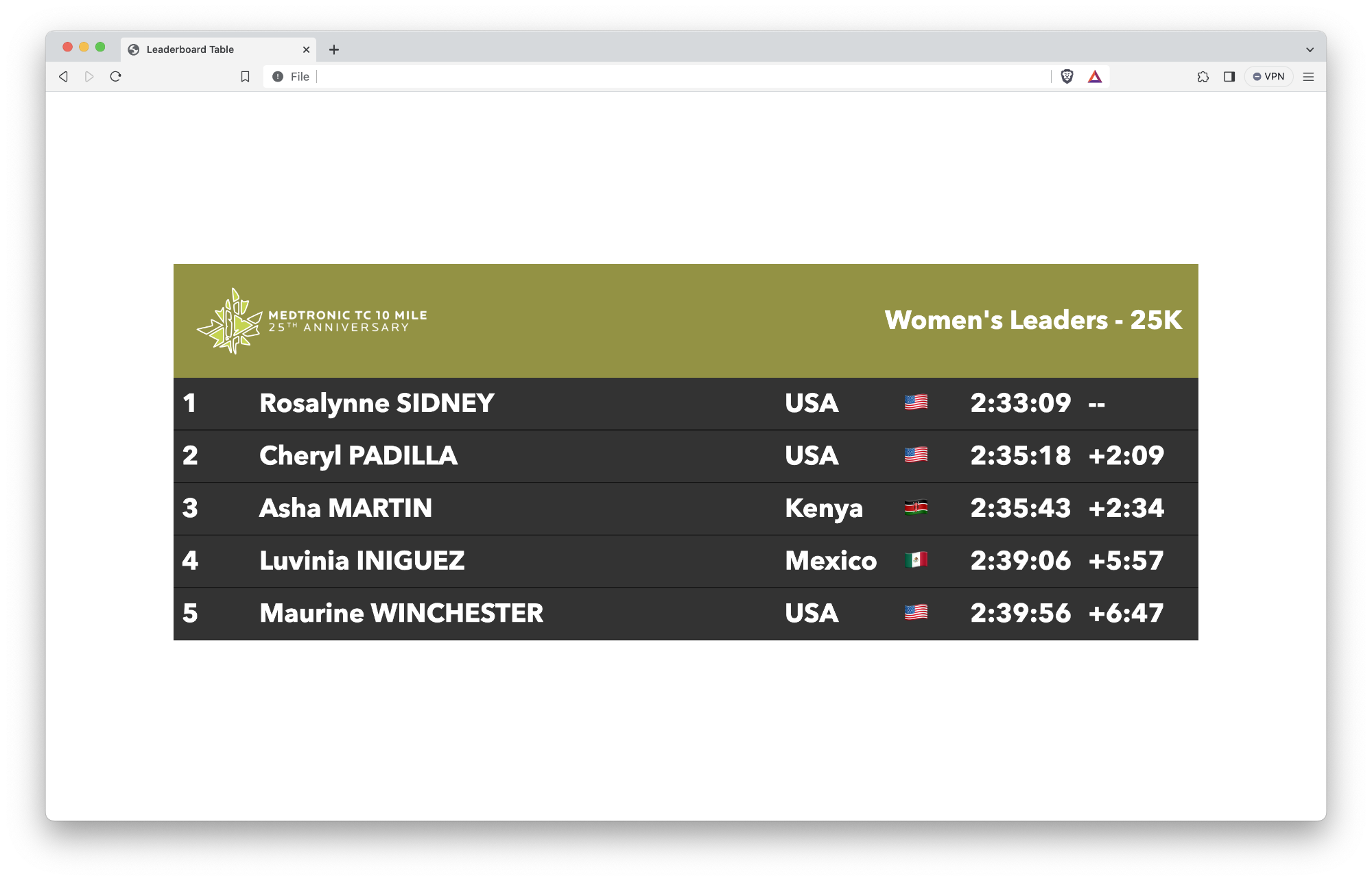
A large leaderboard graphic for television

This is a leaderboard intended to be a full-screen graphic, likely to be used with a blurred static shot under it.
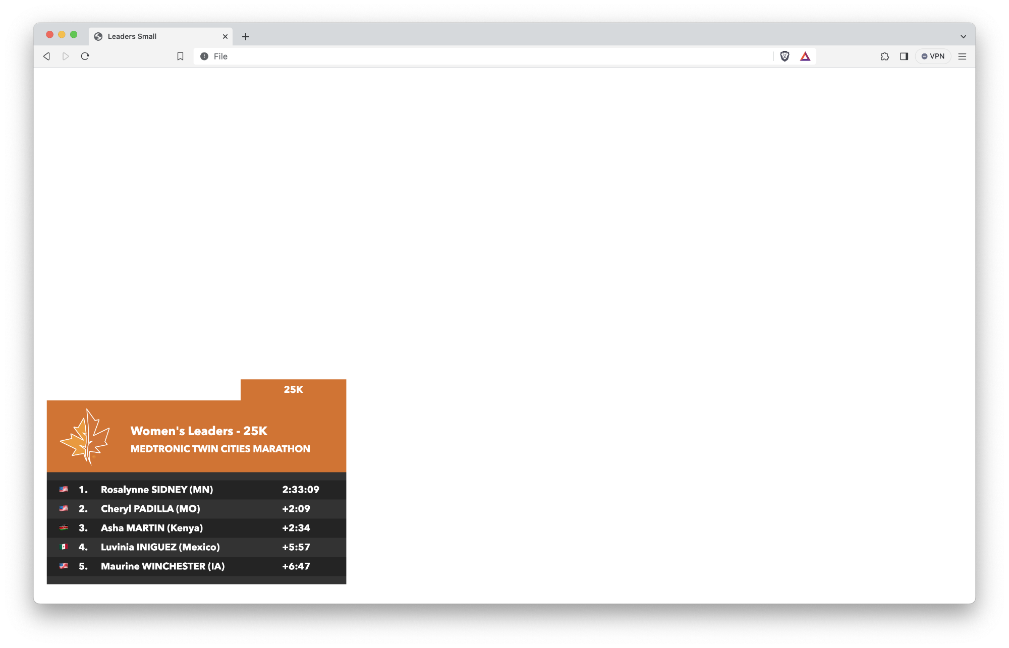
A small leaderboard graphic for television

This is a leaderboard intended to be used while on top of a single shot with the leader in full frame.

The timing data

I was fortunate to spend the beginning part of my career working with the crew at Mtec Results. They are the team that helps time many of the major races around the country, most notably the Twin Cities Marathon and Grandma's Marathon, but they also are often called on to help out with other high-profile races like the marathons in Boston and New York City.

It took about 3 minutes of explaining the idea of using "real time data"[^tcm-2023-recap-1] to the team before it was met with a resounding "how can we help?"

We went back and forth around file formats and specs, and after we worked our way through uninteresting technical challenges[^tcm-2023-recap-2], we ultimately settled on a CSV format that looked something like this:

BIB,FIRST NAME,LAST NAME,GENDER,AGE,CITY,STATE,NATIONALITY,TEAM,TEAMTYPE,TIME OF DAY FINISH,GUN TIME,NET TIME,5K,10K,15K,20K,HALF,25K,30K,35K,40K,FIRST_HALF,SECOND_HALF,5 MILE
103,Rosalynne,Sidney,F,31,Burnsville,MN,USA,,,10:33:07.73,2:33:09,2:33:09,18:10,36:24,54:43,1:12:48,1:16:51,1:30:56,1:48:57,2:07:38,2:25:40,1:16:51,,

We decided given our time constraints, we would just keep that CSV in a shared Dropbox folder, and that file would get periodically updated throughout the race.

The graphics

The production team at Freestyle Productions uses an open source tool called SPX Graphics to generate and play back graphics during broadcasts.

SPX Graphics is a fascinating tool that uses HTML, JS, and CSS along with layers to help display all sorts of useful graphics like bugs, lower thirds, and crawls.

It took a little troubleshooting to understand the template structure that SPX uses, but in conjunction with ChatGPT, I was able to build out some basic HTML to create a table that I could dynamically populate:[^tcm-2023-recap-3]

<body>
  <div id="viewport">
    <div id="spxTable">
      <header>
        <div class="logo" id="marathon-logo">
          <img src="./TCM/tcm-logo.png">
        </div>
        <div class="logo" id="ten-mile-logo" style="display: none;">
          <img src="./TCM/ten-mile-logo.png">
        </div>
        <div id="title-container">
          MEN-FINISH
        </div>
      </header>

      <section class="table-body">
        <div class="table-row">
          <div>1</div>
          <div>Rosalynne SIDNEY</div>
          <div>USA</div>
          <div>??</div>
          <div>2:33:09</div>
          <div>--</div>
        </div>
        <!-- Add more table-row divs as needed -->
      </section>
    </div>
  </div>
</body>

Hooray, we now have a basic table for a full screen leaderboard! If you throw a little fancy CSS on top of it, you have a really nice looking table.

...but how do we populate it?

Translating the timing data

The CSV that I showed above contains some great data, but it's not particularly useful at the moment.

For starters, if I want to show the current leaders at 25K, do I use the values in the 25K row or do I use the values in the gun time row?

If I want to show how far back each racer is from each other (the time differential between each person), how do I generate that?

What happens if the racer's last name got entered in ALL CAPS instead of Title Case?

I figured I needed to write a tool that helped me transform this data into something a little easier to manipulate from the leaderboard template... so I did!

Behold, csvToJson.html in all its glory!
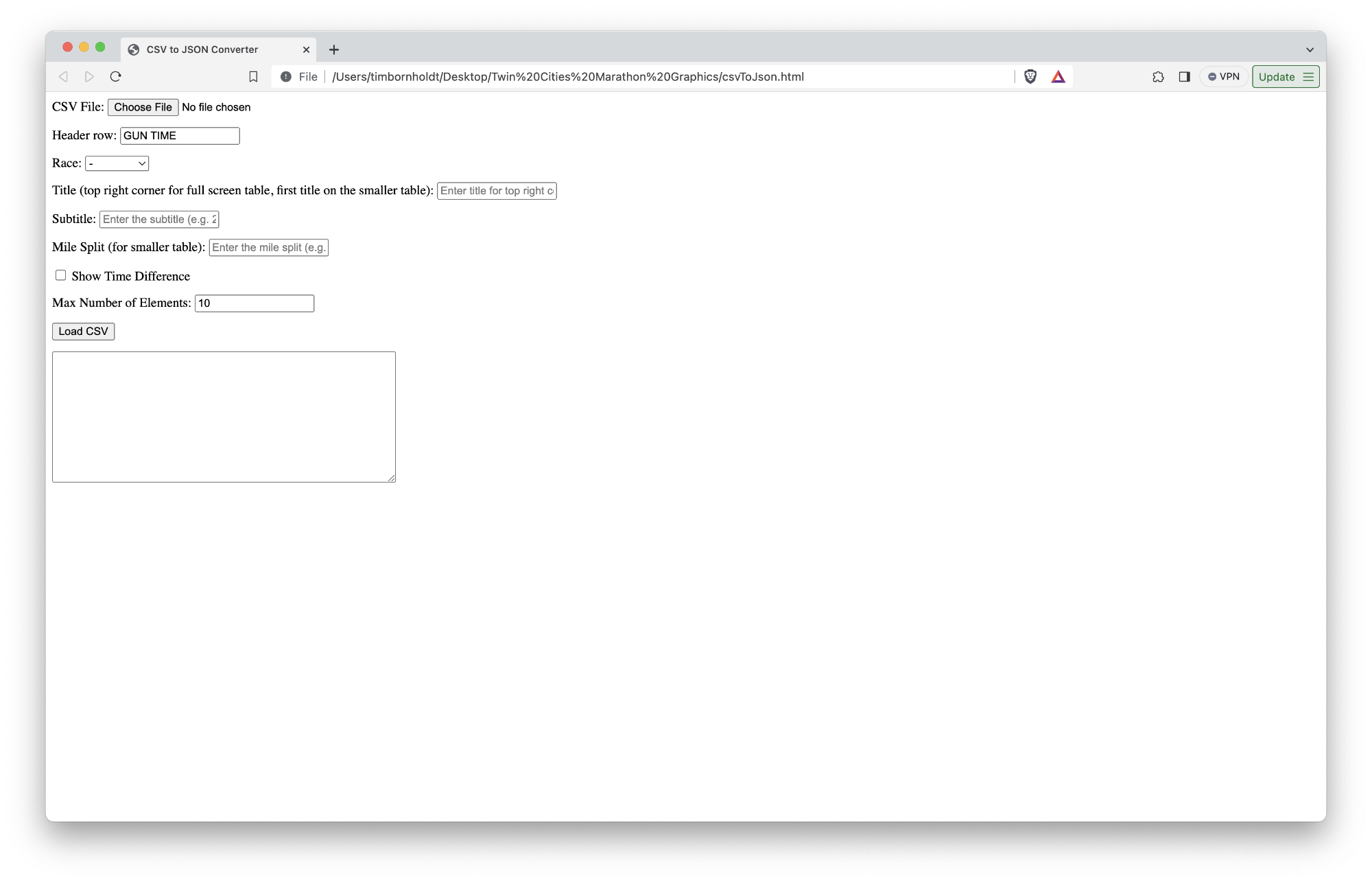
A screenshot of my rudimentary JSON generator

Because I know I'm going to forget what all these fields are for come next year, here's an explanation of what each field does:

  • CSV File: This is a basic input field to grab the CSV file from a local disk.
  • Header row: This is the name of the header row for which I want to pull the timing value (e.g. GUN TIME, which would pull 2:33:09 from the CSV example above)
  • Race: This allows me to tell the front end template which race to style it as
  • Title: This is the title in the top right corner for the full screen version or the first title on the smaller version
  • Subtitle: This is the second title on the smaller version (basically the name of the race)
  • Mile Split: In the smaller graphic, there's a little notch in the top right corner that contains the mile split for the most recently passed timing mat. This field lets me fill that in with the split.
  • Show time difference: On the full screen graphic, we may (or may not) want to show the time difference (e.g. +2:09).
  • Max number of elements: This should've probably said "max number of rows" because that's what this field controls. The full screen version of this graphic looks best with 10 entries, whereas the smaller version of the graphic looks best with 5.

Once you click "Load CSV", I fire off a Javascript method which loads the CSV and converts each row into a JSON object that looks something like this:

{
  "race": "marathon",
  "title": "Women's Leaders - 25K",
  "subtitle": "MEDTRONIC TWIN CITIES MARATHON",
  "mile_split": "25K",
  "show_time_difference": true,
  "table_data": [
    {
      "position": "1",
      "name": "Rosalynne SIDNEY",
      "time": "2:33:09",
      "difference": "--",
      "state": "MN",
      "country_name": "USA",
      "country_flag": "??"
    },
    // More entries here
  ]
}

I would then take that JSON and paste it into a file stored on a remote server.

Now that I have both a beautiful-looking template and a beautiful-looking source of data, I was able to whip up some Javascript on the template side to read that file on page load and populate the table with all the customizations included on it.

What's next?

It was truly a bummer that the race didn't get started. As someone who has gotten heat stroke at mile 21 of a marathon, I know that the organizers of the race did the right thing by cancelling it outright.

As someone who was in charge of building and displaying these graphics, though, I am a bit relieved that I get another year to iterate on this foundation.

Here are the obvious areas for improvement:

Automate the fetching of the data from Dropbox

If it wasn't clear, this process was brittle and prone to human error. I was having to load Dropbox from the web, download a CSV, manually sort it in Numbers based on the gun time, remove all but the top 10 or so rows of data, and then save a sanitized version.

There could be a tool written to automate this process so it is continually polling for updates to the file, and once it finds updates, it automatically does the sorting and converting so I don't need to touch it.

Automate the creation of the JSON from that timing data

Similar to above, I shouldn't need a csvToJson.html file. Because I'm sharing the data between the two templates, I should hard code the number of rows I want each template to read, and then I can fully automate the creation of the JSON it uses to populate the table.

Also, because of how SPX works, I need to host that JSON file somewhere remotely that the graphics system can access whenever the director calls for the graphic. That process should be similarly automated.

Improve the flag display

The Twin Cities Marathon attracts professional marathoners from all over the world, but it's not uncommon to see Minnesotans and other Americans finish in the top 10. It might be cool to use state-level flags instead of the US flag for the top athletes.

Another little annoying thing: I only had five countries hard-coded in my JSON creator because that was what I had from the representative data sample (USA, Canada, Mexico, Kenya, and New Zealand). I should probably support more flags because you should always be prepared for an unexpected performance from someone not from one of those five countries, right?

MOAR GFX PLZ KTHX

This leaderboard only scratchs the surface with what's possible.

With the timing data we're getting, I should be able to have a permanent graphic built that shows the top 10 runners at all times.

I should also have more graphics that you see in most professional marathon broadcasts:

  • An omni-present clock[^tcm-2023-recap-4]
  • Biographic slides that show a runner's photo along with some of their professional highlights
  • Slides with historical facts (course record holders and whatnot)
  • A map showing where runners are along the course

But I want more!

If we start planning now, we could attach biometric gear to some of the runners and show things like current heart rate, current pace, current stride count, and more.

Even if we aren't able to pull that off, we could still use the existing data to tell interesting stories like how the hill on Summit Avenue affects pace and how many runners are actually hitting "the wall".

Gearing up for 2024

I am so pleased with what we were able to pull together in basically a week.

Now that we have a better understanding of the technology that powers the graphic system, I am beyond excited at the possibilities ahead of us next year.

The team at Twin Cities in Motion truly care about putting on a best-in-class event for runners. Their commitment and investment in this broadcast are evidence of this, and I am honored to be part of the team responsible for telling the story of the two races that take place that day.

Mark your calendars for next October. It's gonna be an exciting race to watch live!

[^tcm-2023-recap-1]: For our purposes, we basically mean up to date within a minute or two of capturing the data. Getting updates to the leaderboard within milliseconds of a racer crossing a timing mat is not yet technically feasible. Besides, time is an arbitrary construct, right, maaan? [^tcm-2023-recap-2]: The software used to capture timing/scoring data for races is necessarily archaic. I say "necessarily" because it's both a feature and a bug; you don't want to put your trust in some fancy pants, brand new, untested Javascript framework to calculate results for an event that depends on those results for attracting big name runners, sponsors, and money. Of course, you can wrap all sorts of transforming layers on top of the data you collect from the timing systems, which is what Mtec does to power their results pages. But creating an API on top of that layer was not really feasible in the time we had. [^tcm-2023-recap-3]: You might notice in that HTML that I have two logos: one for the marathon and one for the ten mile. This allows me to reuse the same leaderboard graphic but style it orange or green to fit the relevant race. Also, stop judging my HTML! [^tcm-2023-recap-4]: Do you know how hard it is to get an accurate clock to display on screen? The homies that create professional football graphics are insanely talented. Again, time is an arbitrary construct.


The Disappearing Art Of Maintenance

originally shared here on
↩ replying to Alex Vuocolo · noemamag.com

Whatever comes next must take responsibility for that legacy, while also articulating something new and perhaps even bolder than what came before. There is a useful lesson drably concealed in the MTA’s maintenance facility in Queens: What we inherit comes with responsibility. Vintage machines are owed our best efforts, and our ingenuity in keeping them running should at least be equal to our ingenuity in forging them. 

The work of maintenance is ultimately a way of parsing and knowing a thing and deciding, over and over, what it’s worth. “Maintenance should be seen as a noble craft,” said Rossmann, the boot-strapping repair man who learned the secrets of the iPhone’s circuits. “It should be seen as something that teaches people not just how to repair, but how to think.”

This article reinforced one of my core tenets of software engineering: the simpler, the better.

It also supplies an important distinction between repair and maintenance. Repair is when you fix something that’s broken. Maintenance is about making something last.

The article calls for finding a way to better incentivize acts of maintenance in our economic system, and the more I reflect on that, the more I find it reasonable.

Building new stuff is cool and often necessary, but finding a way to make our old stuff last longer is equally cool.

Not just with our bridges and train cars and iPhones, but with our elderly too.

Continue to the full article


There's still no silver bullet

originally shared here on
↩ replying to a post on changelog.com

Saying “use the right tool for the job” is easy, but actually selecting the right tool for the job is anything but. Good tools are hard to find, hard to evaluate, hard to learn. We have constraints, we have biases, we have shortcomings.

But that’s all part of the work.

And if you “just use Go” or “just use React” or “just use Postgres” for every problem that crosses your keyboard, you’re just not putting in the work.

I’ve only worked in agencies my entire professional career, and that work has honed two important traits of a good engineer: curiousity and agility.

Being curious gives you the ability to explore new tools and understand how they work.

Being agile (not in the project management sense, but the “moving freely and quickly” sense) gives you the ability to deploy those tools to solve increasingly complex problems.

It’s not that I don’t have a standard set of tools I reach for when solving a wide swatch of problems (Rails, Postgres, etc.), but as I get older, I’m finding that I am more willing to engage with newer tech.

I come from a background of writing Javascript by hand, but I'm starting to play more with Vue and React, and I can see why people like these tools.

Same thing with CI/CD pipelines. I always thought they were more fiddle-y and brittle than they were worth, but that's because I've generally been a lone wolf. In a team context, they are extremely useful.

If you keep hearing noise about a new technology, it's probably worth taking a look over the fence to see how that tool could be used.

Continue to the full article


The blind programmers who created screen readers

originally shared here on
↩ replying to Sheon Han · theverge.com

For most companies, accessibility isn’t a priority, or worse, something that they pay lip service to while doing the bare minimum to meet regulatory compliance. Ojala’s pet peeve is people thinking that accessibility is a feature, a nice-to-have addition to your product. When they tack on accessibility later, without thinking about it from the very beginning, Ojala can tell — it feels haphazard. (Imagine first creating a product with a colorless UI, then to add colors later as an afterthought, only to use the wrong color combination.)

I heard long ago that the reason developers should start testing software with accessibility in mind is that everyone, at some point in their life, will benefit from accessible technology.

At a minimum, as your eyesight gets older with age, an increase in font size will make it more comfortable to read things.

Any story that revolves around a few people banding together to solve an actual problem, and how that solution literally changed people’s lives, is so inspiring to me.

It’s what I yearn for at this point in my life. I don’t mind making money and building apps which drive business value. The stability of my job has done wonders for my mental health, and I am supremely grateful that I have it.

But boy, wouldn’t it be fun to get to work on something that has an outsized positive impact on people’s ability to live productive lives?

Continue to the full article


Programming Sucks

originally shared here on
↩ replying to a post on stilldrinking.org

Here are the secret rules of the internet: five minutes after you open a web browser for the first time, a kid in Russia has your social security number. Did you sign up for something? A computer at the NSA now automatically tracks your physical location for the rest of your life. Sent an email? Your email address just went up on a billboard in Nigeria.

These things aren’t true because we don’t care and don’t try to stop them, they’re true because everything is broken because there’s no good code and everybody’s just trying to keep it running. That’s your job if you work with the internet: hoping the last thing you wrote is good enough to survive for a few hours so you can eat dinner and catch a nap.

As poignant, true, and depressing as it was back when it was 2014.

Continue to the full article


Craig Mod: Fast Software, the Best Software

originally shared here on
↩ replying to a post on craigmod.com

Speed in software is probably the most valuable, least valued asset. To me, speedy software is the difference between an application smoothly integrating into your life, and one called upon with great reluctance.

I’ve tried articulating this notion to my clients, but now I’m just gonna send them this article.

If you manage a software project, or are interested in software development, Craig’s thoughts are a must read.

Continue to the full article


RailsConf 2019 - Opening Keynote by David Heinemeier Hansson

originally shared here on
↩ sharing a video from youtube.com

I've never heard any of DHH's RailsConf keynote speeches before, so I guess I kind of expected it to be more about the state of Rails and where things are going.

In a way, I suppose this is that. But really, it's a personal manifesto about the intrinsic value of software, human worth, and capitalism.

This was mind bending and well worth the watch.


How to detect and replace YouTube links by extending the Redcarpet gem

originally shared here on

As I'll explain in a future post, I had an old Wordpress blog that I got sick of maintaining and updating, so I did what any red-blooded developer would do: build my own blog engine.

In doing so, however, I needed to import all my old posts from Wordpress over to my own Rails form. This worked nearly flawlessly, with the exception of my YouTube videos, which looked something like this (without the space inside the tag):

[youtube]nFZZxOHHZlo[/youtube ]

Because I am using the Redcarpet gem, I thought I'd extend its parsing capabilities to detect anything like this and wrap it in a responsive frame.

Here's how I did it (with extreme thanks to this SO post):

Step 1: Create a folder called app/services, and then create a file called custom_markdown.rb:

class CustomMarkdown < Redcarpet::Render::HTML
  def preprocess(text)
    format_youtube(text)
  end

  def format_youtube(text)
    text.gsub! /\[youtube](.*?)\[\/youtube]/ do
      "<div class='embed-container'><iframe src='https://www.youtube.com/embed/#{$1}' frameborder='0' allowfullscreen></iframe></div>"
    end
    text
  end

end

This code will perform a regular expression to find anything wrapped in [youtube] tags and replace it with a <div> that we can now style with CSS.

Step 2: Add the following SCSS somewhere in your project where it makes sense:

.embed-container { 
  position: relative; 
  padding-bottom: 56.25%; 
  height: 0; 
  overflow: hidden; 
  max-width: 100%; 
  iframe, object, embed { 
    position: absolute; 
    top: 0; 
    left: 0; 
    width: 100%; 
    height: 100%; 
  }
} 

Step 3: Use the custom parser when including Redcarpet in your project:

require './app/services/custom_markdown.rb' # This was necessary for me, might not be necessary for you
@blogs = Blog.all.order("published_at desc")
renderer = CustomMarkdown.new()
@markdown = Redcarpet::Markdown.new(renderer, extensions = {})

Now, anywhere you use those [youtube] tags, you'll get this fancy rendering instead:


Trying to put vertically-scrolling text in a UIScrollView? Don't.

originally shared here on

It took me about 3 hours of research and pulling my hair out to try and implement a UIScrollView that just scrolls a bunch of text vertically.

Turns out UIScrollView is for images, and UITextView is for text.

Talk about your ultimate face palm.


CTolleRun.com Redesign

originally shared here on
↩ replying to a post on ctollerun.com

This week, we launched version 3 of CTolleRun.com. It's the result of several months of planning, organizing and development, and I thought I would take a few moments to share exactly what we've changed and the process behind it.

Our last redesign of the webpage was earlier this year. Truthfully, the site was rushed out in a hurry because we needed to have something live, so I pushed it out with the intention of upgrading it piece-by-piece down the line. Of course, we never got around to actually upgrading anything, and ultimately, we decided that time would be better spent on re-building from the ground-up.

The biggest conceptual change on the site was to give each episode its own page. This would give us a chance to better showcase our content, as well as drive our SEO. In order to implement this, however, required implementing a more robust, custom CMS1. Before this redesign, we were able to input the basic information: episode name, description, YouTube link, etc. Now, we are able to add several elements which make each page unique and more appealing for our viewers:

Links Almost every podcast I admire includes a list of links with each episode. This makes it easy to give viewers the chance to dive deeper into a specific topic, as well as share links we've mentioned in the episode. It also allows us to drive more traffic to the photo albums we've uploaded to Facebook.

Featured Guests We have the luxury of having some pretty awesome people on our show. Unfortunately, many of the guests we've had on our show aren't yet household names. Many people know who Kara Goucher is, but not a lot of people recognize Hassan Mead. If a viewer doesn't recognize who they're about to watch, it doesn't give them a lot of incentive to watch the episode.

To combat this, we included a short biography of each guest. We figured it's a simple way to boost viewership of those episodes as well as rank them higher on Google. In the future, I'm hoping to add links to these guest's social media accounts, as well as personal blogs or team pages.

Sponsors Before I became an avid podcast consumer (and creator), I loathed advertising. I ran ad-blockers on all my computers and I skipped over every sponsorship spot I possibly could.

It's really a shame, though, because a lot of the advertisers who throw money at podcasts like ours really seem to get it. They just want to put their product or race in the hands of people who maybe would've never even heard of it otherwise.

It's understandable that you don't want ads shoved down your face, though, which is why we've presented our ads in the ways we have. Each episode with a sponsor gets mentioned at the top of the show, and each sponsor gets an ad permanently embedded on the episode's page. We also have two "title sponsor" spots that are prominently displayed on the main page. That's it.

We think this is win-win-win: we are able to get you in touch with our sponsors, our sponsors are able to get permanent placements of their product and you are able to find out about some cool products, services and races without being hassled.

Social Media A huge focus for this redesign was to better integrate the site with social media. Here's what we did to optimize for our key three networks:

Facebook: If you're a developer, and you're not using Open Graph tags, you're missing out. By using Open Graph tags, we were able to turn our bland-looking links into this:

An added bonus: if you specify the OG tags for og:video and og:video-type, Facebook will embed the YouTube video in-line! Here's the code I used for that: <meta property="og:video" content="http://www.youtube.com/v/<? echo $youtubeID; ?>?version=3&autohide=1" /> <meta property="og:video:type" content="application/x-shockwave-flash" /> Twitter: If you're not simply sharing an article or some photos, Twitter's new Cards functionality is a bit more complex than simply adding OG tags. In order to make a functioning Player Card, Twitter wants you to build a page that gets embedded in an IFRAME. In a similar vein to what we're doing with Facebook, we're standing on the shoulders of giants and simply embedding YouTube's Player Card with our episode ID passed through: <meta name="twitter:card" content="player" /> <meta name="twitter:site" content="@CTolleRun" /> <meta name="twitter:player" content="https://www.youtube.com/embed/ echo $youtubeID; ?>" /> <meta name="twitter:player:width" content="640" /> <meta name="twitter:player:height" content="360" />

And out comes this:

Note that the Twitter Card API requires the use of twitter:title, twitter:description, twitter:image and so forth. Thankfully, if you're already using og:title, og:description, og:image and so forth, you don't need to re-include them.

Pinterest: Unfortunately, Pinterest doesn't have a public-facing API yet. Essentially, all we can do is include a "Pin It" button for each episode. We'd really like to get a bigger presence on Pinterest, however, because it seems like a good portion of our target audience is there. Here's hoping for that API soon!

A note about Google+, App.net, etc.: I think it's important to not get too crazy with social networks. Sure, it's easy enough to drop a +1 button on each page, as well as a hundred other buttons. However, for each service you include, you're not only adding more visual clutter to your page; you're increasing the page's load time by executing a hundred different pieces of remote Javascript code.

If we get a huge demand to add another service to our site, or if Facebook loses a million followers, we'll go there. We're not dummies, but we're also not in the business of predicting which services will be the best. Facebook, Twitter and Pinterest seem to be our best options today. We'll adapt as time goes on.

More Robust RSS Feeds Our RSS feeds (video and audio) aren't the most popular way to get our episodes2, but it's my personal favorite, so I made an effort to optimize this experience as well. Each item in the feed includes the linked list as well as the episode's sponsors. We also include the file size and run time of each episode, which means the fancy podcast clients will be able to show that information without any big-city processing on their end.

MailChimp We converted our mailing list over to the incomparable MailChimp. It's everything you could possibly want in a mailing list provider, but for free. My only gripe with them thus far is that the templates aren't 100% customizable, but it's just about the only fault I can find with them. Seriously, if you do mailing lists, you should be doing them through MailChimp.

Front Page Slide Show Whenever a client requests a rotating slide show, my go-to choice has always been Nivo Slider. For this project, however, I needed a solution that allowed me to use two <div> tags for a caption (one on top, one on bottom). With Nivo Slider, the solution I came up with was to put two smaller <div>'s into 1 giant <div>. Unfortunately, that meant the image wasn't clickable, which defeated the purpose of the slider.

I tried a few different sliders and ultimately settled on Camera by Pixedelic. This awesome slider allowed me to place as many <div>'s (or any other kind of crazy mark-up) on top of the image while maintaining its clickablilty. My only gripe is that the slideshow doesn't work as well in IE, which is, of course, no surprise to anyone.

Internet Explorer Fixes Speaking of every web developer's best friend, Internet Explorer provided the majority of trouble for this redesign. I kept getting alignment issues with IE while using Nathan Smith's excellent 960 Grid System, so instead of learning a whole new system (like the Responsive Grid System which I'm highly considering for future projects), I just added the <meta> tag which forces IE to render everything as if its IE7 (even if you're on a newer version):

<meta http-equiv="X-UA-Compatible" content="IE=EmulateIE7" />

Of course, this is a very inelegant solution, but I'm just sick of wasting so much time making sites look good in IE when every other browser (even Opera) gives me less guff.

Embedded Tweets in the Footer It's all about keeping your site fresh and up to date, right? I thought the best way to do this was to write a script that cached our latest Tweet server-side. I'm not sure if it fully complies with the infamous Rules of the Road, but since our use doesn't really allow for tons of Branding®©™, I think we'll be okay.

I ended up using WebcodingEasy.com's fantastic Convert twitter created_at time format to ago format script to make our time appear like Twitter's "12 minutes ago" format, as well as another open source script (which I, embarrassingly, can't find right now) to convert all tweeted links into clickable links.

The toughest part was writing the Tweet caching script. Essentially, my script reads a Tweet which was saved onto the sever from the Twitter API. When it's saved, I append a variable called cached_Tweet_Time along with the current server time. When someone loads the footer, it will read the cached Tweet and check the time. If it's less than a minute old, the script returns the Tweet from the server. If it's more than a minute old, it fetches a Tweet from Twitter. If anyone is interested in the source code, let me know and I'll post it here.

In the future, I'd like to append the script so it only returns Tweets which aren't "at-replies".

In Conclusion This has been one of the most ambitious site designs I've ever completed3, and I am quite pleased with how it has turned out. Front-end design has never been my strong suit; in fact, most of my designs end up looking the same. This time, however, I forced myself to look outside of my wheelhouse and try something new. I hope you guys like it, and if you have any questions, let me know.


  1. Before this redesign, we were running everything on a custom CMS that was integrated with our owner's race results page. The new CMS consists of multiple, custom databases which all link together. :adjusts nerd glasses: 

  2. I believe (as of a few weeks ago) we have a combined total of 120 subscribers to these feeds, which is in the ballpark to how many people reach our page through our e-mail newsletters. 

  3. The only bigger project I can think of right now was That's Unpossible, and that underwent somewhere around 9 redesigns and spanned across 6 databases. 

Continue to the full article